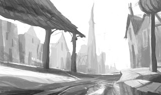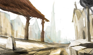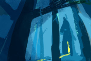


Tried two different approaches to Background sketches today. The first was rendering a sketch in Black and white and laying colour over it, and the second was taking a tiny little thumbnail, blowing it up and playing with it. Personally I like the thumbnail approach- makes more more boldness and happy accidents.
See what you think.

No comments:
Post a Comment